How to Use a Color Wheel for Stunning Color Combinations
No art degree, technical jargon, or complex rules required — just 3 beginner-friendly color combinations
Unlock the secrets of the color wheel without the headache. Master the simple logic of color harmony and gain the confidence to choose stunning combinations. No art degree, technical jargon, or complex rules required! Just 3 beginner-friendly color combinations.
This article is only about color selection — it is not about how to blend, understand shadow positioning, etc. Once you understand basic color selection, these other techniques quickly fall into place.
You only need to understand these three combinations:
- Opposite Colors (Complementary) — For high-energy “pop.”
- Neighbor Colors (Analogous) — For a peaceful, natural look.
- Single-Color Tones (Monochromatic) — For elegant, sophisticated depth.
IN SUMMARY
- You only need 3 color combinations — complementary, analogous, and monochromatic. A color wheel shows you all three instantly.
- Blending opposite colors creates mud, not vibrancy. Keep them apart and they make each other pop.
- Neighbor colors blend smoothly — the easiest fix for flat-looking coloring pages.
- One lighter and one darker version of any color instantly creates depth. That’s all it takes to get a 3D effect.
- A physical color wheel does all the remembering for you. No color names or theories to memorise.
- Even a 150-pencil set becomes manageable once you know you only need 3–5 colors per picture.
Jump to a section:
The Secret to Stress-Free Color Picking
Most colorists dive right in without a plan, only to feel frustrated when colors clash. Understanding a little color logic gives you a simple, friendly roadmap so you can:
- Pick colors instantly without second-guessing.
- Fix the 4 most common coloring mistakes before they happen.
- Create cleaner blends and professional-looking depth with less effort.
- Enjoy the process more because your color palette finally “just works.”
You don’t need any complicated art theories. Just 3 beginner-friendly color combinations that unlock everything you need to know. Once you see how these work on the Color Wheel, you’ll have a visual map for every perfect pairing:
- Opposite Colors (Complementary) — For high-energy “pop.”
- Neighbor Colors (Analogous) — For a peaceful, natural look.
- Single-Color Tones (Monochromatic) — For elegant, sophisticated depth.
The key to mastering them is found right within the Color Wheel — your visual map for every perfect pairing. Use this knowledge for a few coloring sessions. See what works. Experiment and practice.
Your Color Combination Problem Solver
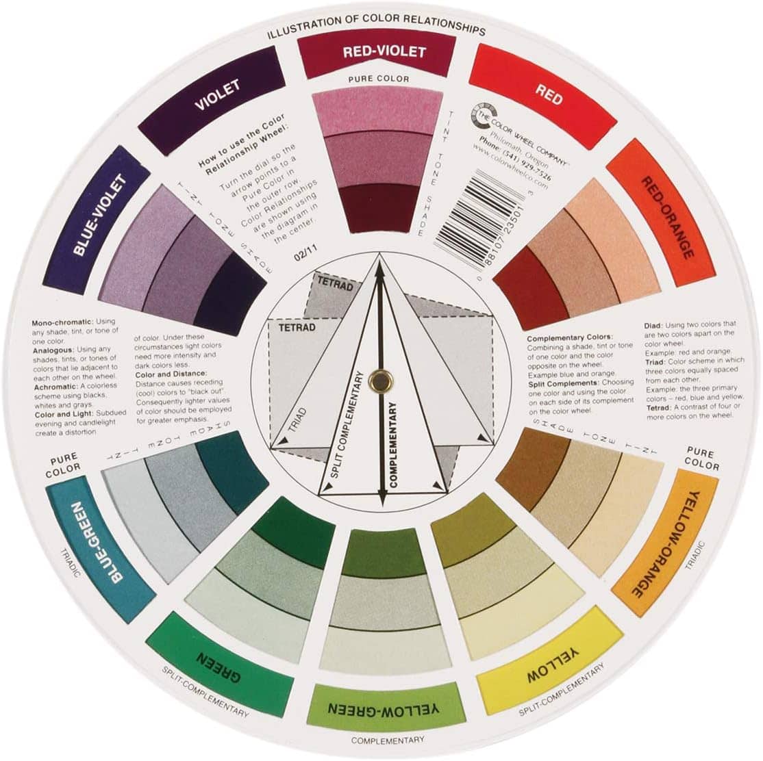
Below is a picture of the front and back of a color wheel. Click to enlarge.
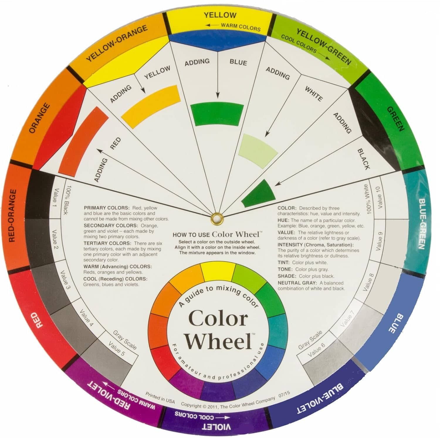
A color wheel comprises three pieces of double sided cardboard with a pin at the centre that turn to provide specific information about color patterns and combinations. It is by far the easiest and quickest way to understand how colors relate to each other.
In the next section is a video showing how those pieces work together — but first, you don’t need to memorise all the fancy terms as they are written right on the color wheel. What is important is understanding how colors relate:
- Side by side or Neighbor colors blend smoothly
- Opposite or Complementary colors create contrast
- Each individual major color (also called a hue) has tints, tones, and shades
- Warm colors create a cosy, inviting feel
- Cool colors create a colder, more distant mood
Knowing these basics helps you predict how colors will behave when you mix, layer, or blend them. Anything you learn beyond these basics is just supporting knowledge.
How To Use A Color Wheel for Beginners
How To Use A Color Wheel for Beginners
The color wheel was invented in the late 1600s by Isaac Newton to map the color rainbow spectrum onto a circle. Since then, the color wheel advanced into multiple versions and became the basis of color theory showing the relationship between colors.
Let’s concentrate on just a basic understanding as it will solve most of your problems right away.
Here is a brief video showing how to use a color wheel. Below that is my summary of the terms used in the video and how I use the color wheel to find the perfect color combination for my pictures. Understanding is the key. You do not need to memorise those terms — they are printed on the color wheel.
These are the terms mentioned in the video.
Primary Colors
Primary Colors (RYB) are Red, Yellow, and Blue.
Secondary Colors
Secondary Colors result from mixing two primary colors. Violet or Purple results from red and blue, Orange from red and yellow, and Green from yellow and blue.
Tertiary Colors
Tertiary Colors are made from a secondary color and a primary color. For example, Red (primary) and Orange (secondary) create the color called Red-Orange.
Warm and Cool Colors
Warm and Cool Colors are on either half of the color wheel. Warm colors range from red-violet to yellow and cool colors from violet to green-yellow. I use warm colors to create feelings of being warm and cosy — such as in front of a fireplace. Cool colors suggest calmness and large open spaces — such as a field of grass under a blue sky.
There is a whole field of study called Color Psychology investigating how colors affect our feelings. It is used extensively in the advertising industry.
Complementary or Opposite Colors
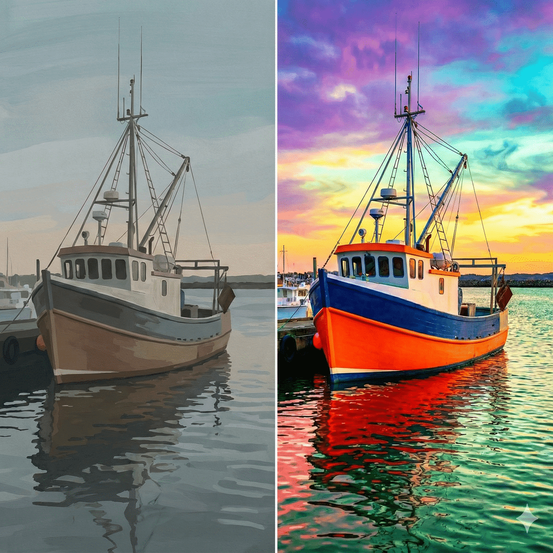
Complementary or Opposite Colors are on opposite sides of the color wheel and provide a high contrast and high impact color combination. So yellow and violet are complementary and contrast against each other to make a picture brighter.
A split-complementary color scheme uses a main color plus the two colors next to its opposite. For example, instead of pairing yellow with only violet, you would use yellow alongside red-violet and blue-violet. This approach provides a high level of visual contrast similar to a standard complementary pair, but it is often easier to manage because the colors are less aggressive when placed together.
A triad scheme uses three colors that form an even triangle on the wheel, like red, yellow, and blue. Because these colors are spread out evenly, they provide high contrast while remaining balanced. Using a triad is a reliable way to ensure your artwork has variety and visual energy, as each of the three colors carries equal weight rather than one overpowering the others.
Monochromatic Colors — Tints, Tones, and Shades
Monochromatic Colors allow you to change how light or dark a color appears without changing the color itself.
- Tints are made by adding white to a color, making it lighter and softer — like a pale pink rose or a clear morning sky.
- Shades are created by adding black, which makes the color deeper and more mysterious — like the dark navy of the ocean or a rich forest at night.
- Tones are a mix of both black and white (gray), which “tones down” the brightness to create subtle, earthy colors — like a soft sage leaf or a weathered stone.
You would use tints to make a room feel airy and bright, shades to add drama and strength, and tones when you want a sophisticated, natural look that is easy on the eyes.
Analogous or Neighbor Colors
Analogous or Neighbor Colors are used to create harmony, a mood, or emotion in a picture — generally found in nature. They are selected from colors that are next to or very close to each other (neighboring) on the color wheel. For example, orange-red, red-orange, and orange could be used to create sunsets or autumn leaves.
The Perfect Color Wheel for You
A physical color wheel is one of the simplest tools you can use to instantly improve your adult coloring pages. I personally recommend a classic color wheel as a great all-round choice, but there are several other formats that might suit your space, eyesight, and travel habits even better.
Below are a few popular options so you can pick the style that works best for how and where you like to color.
-
 4.6View on Amazon$6.66
We earn commission if you make a purchase at no additional cost to you. See Disclosure Statement for further details....
07/15/2026 01:02 pm GMT -
 View on Amazon$6.21
We earn commission if you make a purchase at no additional cost to you. See Disclosure Statement for further details....
07/14/2026 11:02 pm GMT -
 View on Amazon$36.50
We earn commission if you make a purchase at no additional cost to you. See Disclosure Statement for further details....
07/14/2026 08:06 pm GMT -
 View on Amazon$9.99
We earn commission if you make a purchase at no additional cost to you. See Disclosure Statement for further details....
07/14/2026 08:06 pm GMT
How To Apply The Color Wheel To Fix Your Problems
Here are the four most common problems colorists face, and exactly how the color wheel solves each one.
⚠ Dull Picture Problem
⚠ Symptoms
- My finished pages look muddy or dull
- Colors that looked good separately look “off” together
- My coloring lacks vibrancy and “pop”
- Everything blends together instead of standing out
The Cause
You blended colors that “cancel” each other out.
The Theory
When you blend colors that sit opposite each other on the wheel (Complementary Colors), they neutralize each other. For example, if you blend yellow with violet, or red with green, you’ll get a dull, muddy result. Complementary Colors are not meant to be blended — they are meant to be kept apart to provide a high contrast and high impact color combination.
The Fix
Once you can see which colors are opposites on the wheel, you’ll never accidentally create dull pictures again. Instead of blending opposites, you’ll:
- Keep opposites apart — Use them in different areas of your picture where they make each other look vibrant and alive
- Blend neighbors instead — Choose colors sitting next to each other on the wheel (like violet, red-violet, and blue-violet) for smooth, clean blends
- Create strategic contrast — Place opposite colors side-by-side (like violet clouds against a yellow sunset) for maximum visual impact without the mud
⚠ Too Many Color Choices Problem
⚠ Symptoms
- I spend 10+ minutes just trying to select a colored pencil
- I can’t decide which colors to use together
- My 150+ color set overwhelms me with too much choice
- I always end up using the same few safe colors
The Cause
You have too many choices of pencils, markers, and gel pens — so you stick to the ones you feel most comfortable with. You have decision paralysis.
The Theory
Limit yourself to just a few major colors so you’re concentrating on the picture, not the pencil hunt. Use neighboring, opposite, and shading color variations of those initial 3–5 colors.
The Fix
-
1
Choose 1 major color — Let’s say violet for clouds
-
2
Identify its neighbors — Red-violet and blue-violet sit on either side of the color wheel
-
3
That’s your palette — Just 3 colors that blend beautifully together for clouds
-
4
Add depth — Check the color wheel to find the light and dark variations to create depth
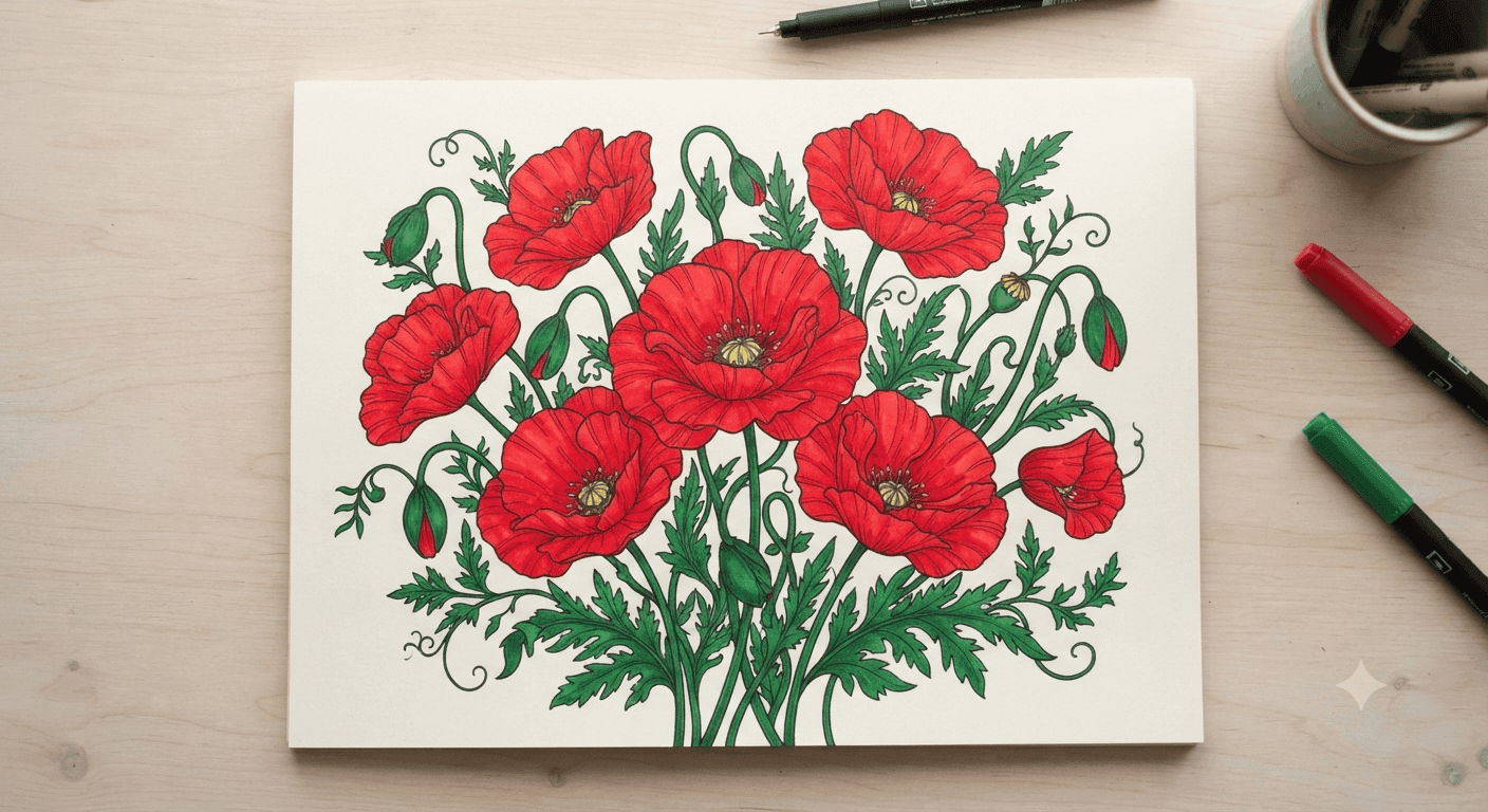
Then for your complete picture, select another 2–4 major colors, for example: violet (clouds) + green (trees/grass) + blue (sky) + brown (tree trunks) = 4 major colors, 3 shades each = 12 pencils total. That’s a full, richly-colored scene from a palette you could hold in one hand.
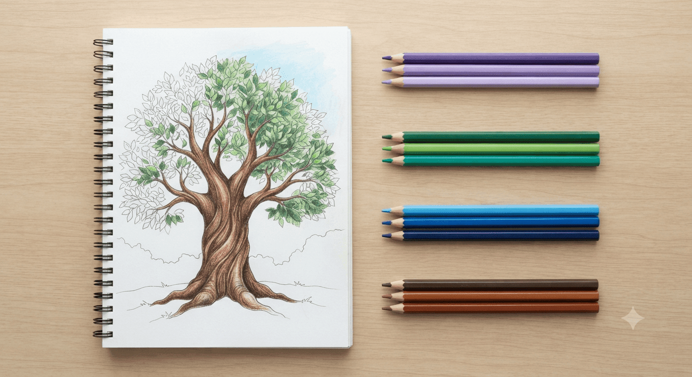
That’s the palette in the photo above — violet and its two neighbors handling the clouds, green and its neighbors doing the trees and grass, with blue for sky and brown for the trunk layered in the same way. The tree is left half-finished on purpose, so you can see each 3-pencil family doing its own job in its own corner of the picture without needing to touch any of the others. Twelve pencils, four jobs, one complete scene — and you already know how to build a palette this size for anything you color next.
Concerned about keeping track of all those colors selected? See Planning under Professional Colorist Tips below.
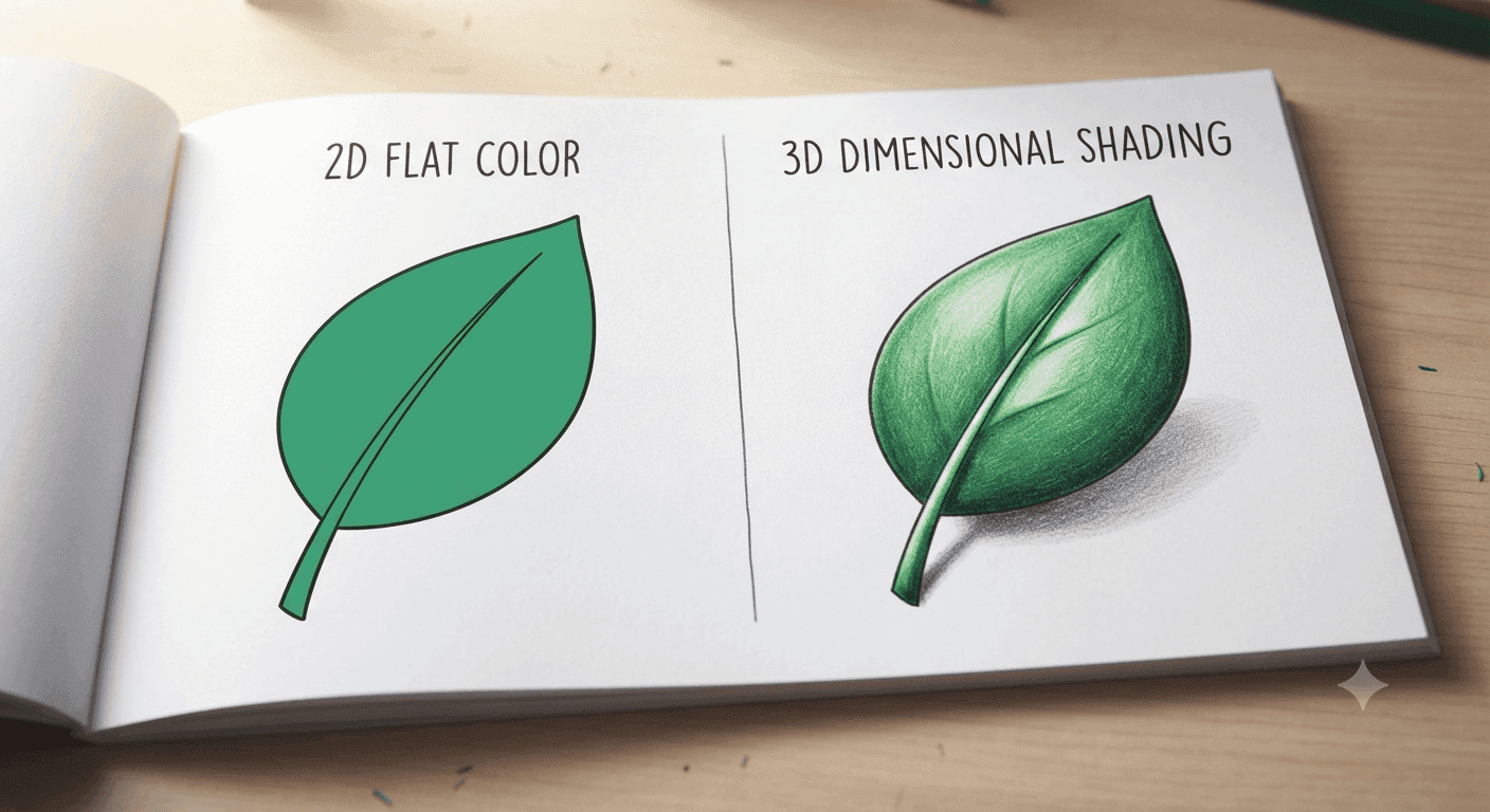
⚠ No Depth in Picture Problem
⚠ Symptoms
- My coloring looks flat
- I can’t create realistic shadows
- Everything looks the same brightness
- My pages lack depth and dimension
The Cause
Real objects have light and dark areas, but if everything is the same color, it looks flat.
The Theory
While the color wheel starts with the major colors, each of those colors has Tints, Tones, and Shades. Once you know you’re about to color a cloud violet, you immediately know you can select neighboring colors for blending and light and dark violet to create depth.
The Fix
-
1
Choose your color — Let’s say violet for a cloud
-
2
Find the light version — Light violet (the color with white added)
-
3
Find the dark version — Dark violet (the color with black added)
-
4
Apply strategically — Light where the light source hits, dark on the opposite side, medium in between
💡 Quick Reference
For every major color you use, automatically grab one lighter and one darker version. Apply light where the light source hits, dark on the opposite side, and medium in between. That’s it — instant 3D effect.
Check out our Advanced Techniques article on Blending for more information on blending, shading, and burnishing.
⚠ Finding the Correct Pencil Problem
⚠ Symptoms
- The pencil barrel color doesn’t match what appears on paper
- I can’t find the color I want when I need it
- I own multiple brands and can’t compare colors across different sets
- Everything’s scattered in original boxes, drawers, bags, and on tabletops
The Cause
Without a system to track the true colors of your pencils, you’re hoping the pencil barrel is the color you need. Plus, if you own multiple brands, you don’t know if that unusual shade of pink you want comes from another set entirely.
The Theory
Firstly, you need a simple system that lets you quickly scan through all of your colors to find the ideal one. Secondly, you need to be able to locate the drawer or case where you stored that color.
The Fix
Use the color chart system for each pencil, gel pen, marker, etc. in each set you own.
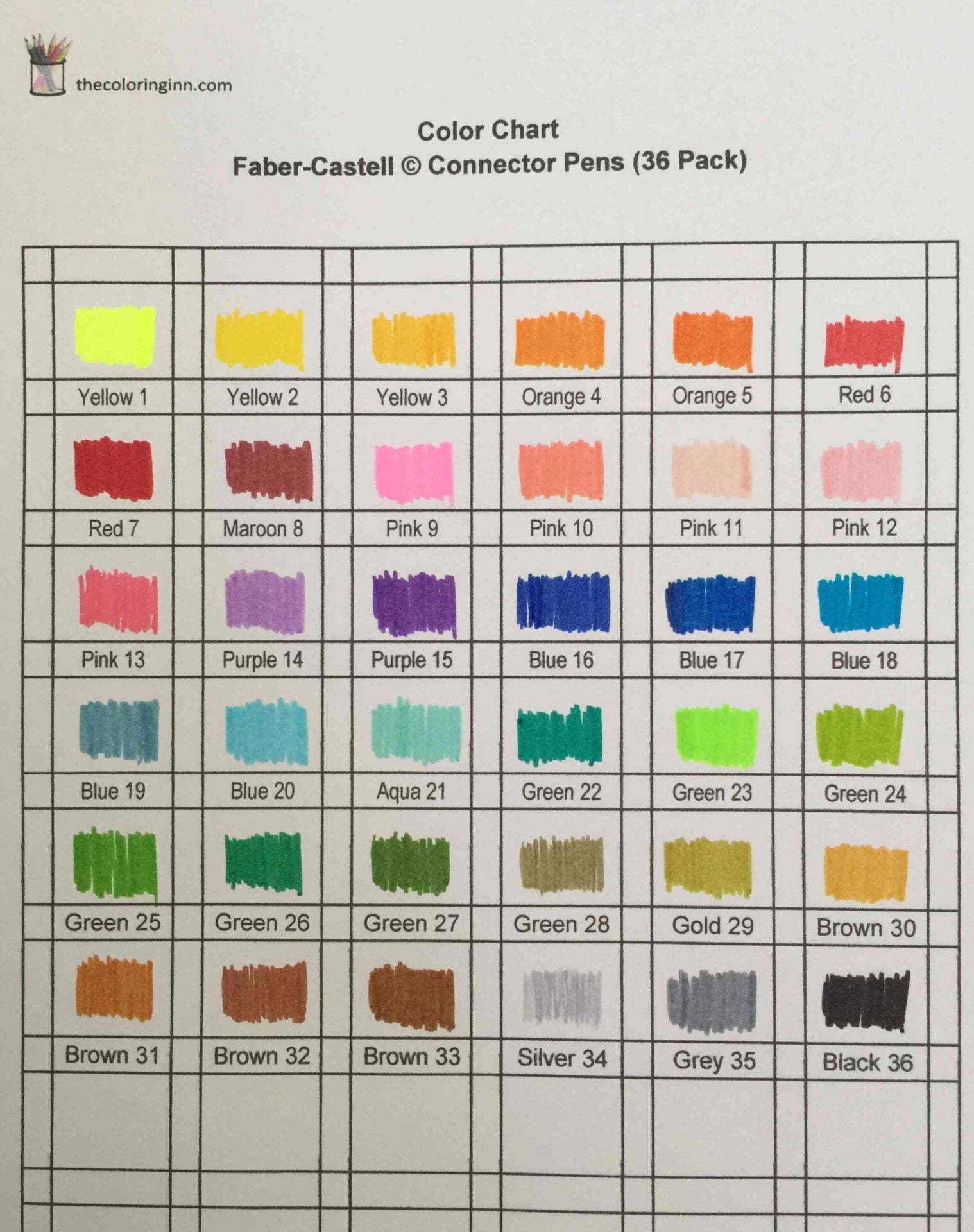
💡 Quick Reference
Color chaos disappears when you have a visual catalog (charts) plus a location map (where each set lives).
-
1
Use the color wheel to identify major, neighbor, and monochromatic colors for your picture
-
2
Scan your chart binder — 1–2 minutes to flip through your color charts to find the ideal colors
-
3
Locate the color — use the color chart map to find the specific storage location
-
4
Grab the color — No digging, no guessing, no wasted time
Professional Colorist Tips
As you practice and gain confidence, you might want to go deeper. These tips are optional upgrades — there when you need them, but not required to get started.
📋 Planning
Some colorists like to document the planning and development of each picture. In a physical or electronic book, they would:
- List the colors they selected for this picture
- Explain any reasons for choosing those colors
- Note why they changed colors during the picture — perhaps a deeper shade worked better
When the picture is completed they put a reference on the physical picture (front or back). That allows them to refer back to the colors and decisions should they wish to use similar combinations in the future.
🗂 Organization Tools
If you have 100+ colored pencils, markers, and gel pens and struggle to find the right one:
- You’ve created your own Color Charts and made your own decisions on color combinations — but have you tried Color Card Collections? These are sets of coordinated color combinations for advanced colorists.
- Here are a few Storage Systems that help safely store your coloring supplies at home or while travelling.
🎨 Advanced Techniques
Once you’ve mastered the basics, try Advanced Coloring Techniques:
- Advanced blending — Different methods for ultra-smooth color transitions
- Professional shading — Where to place shadows for realistic depth
- Layering techniques — Building rich, deep colors through multiple layers
- Backgrounds — Add an interesting background instead of leaving it blank
- Bubbles — Create stunning underwater scenes full of bubble effects
Final Words
The above information is all most beginners need. Honestly, these three patterns will transform your coloring:
- Complementary (opposites) — Creates bright contrasts
- Analogous (neighbors) — Fixes blending color choices
- Monochromatic (light/dark) — Fixes flat, lacking-depth pictures
Master these three patterns, and you’ve mastered color selection. Everything else builds on this foundation — whether it be blending techniques, shading methods, or layering strategies.
You don’t need to memorize color names or complicated theories. Just keep a color wheel nearby while you color, and refer to it when:
- Choosing which colors blend well (neighbors)
- Deciding which colors create contrast (opposites)
- Selecting lighter and darker versions (tints, tones, and shades)
The color wheel does the remembering for you.
Here’s my advice: Don’t try to learn everything at once. Start with the color wheel basics. Use that knowledge for a few coloring sessions. See what works and what still feels challenging. Experiment and practice. Write down what color patterns work and what doesn’t.
Then come back and try another color pattern.
New to adult coloring altogether? Our Getting Started Guide walks you through choosing your first supplies and setting up your coloring space — a natural next step once you understand how color selection works.
Take it at your pace.